1枚の画像を動かす
ナユタン星人のMVみたいな
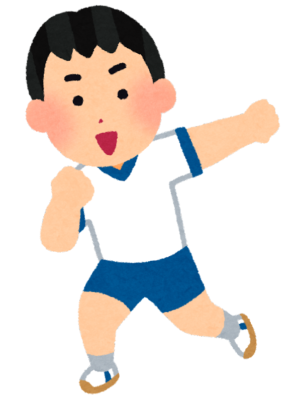
                    .dance {
    animation: dance 0.6s steps(1) infinite;
}

@keyframes dance {
    0% {
        transform: scaleX(1);
    }

    50% {
        transform: scaleX(-1);
    }

    100% {
        transform: scaleX(1);
    }
}
つながった1枚の画像を少しずつずらして表示させる
ストップモーションアニメみたいな
以下の画像を少しずつずらしてアニメーションにしています。
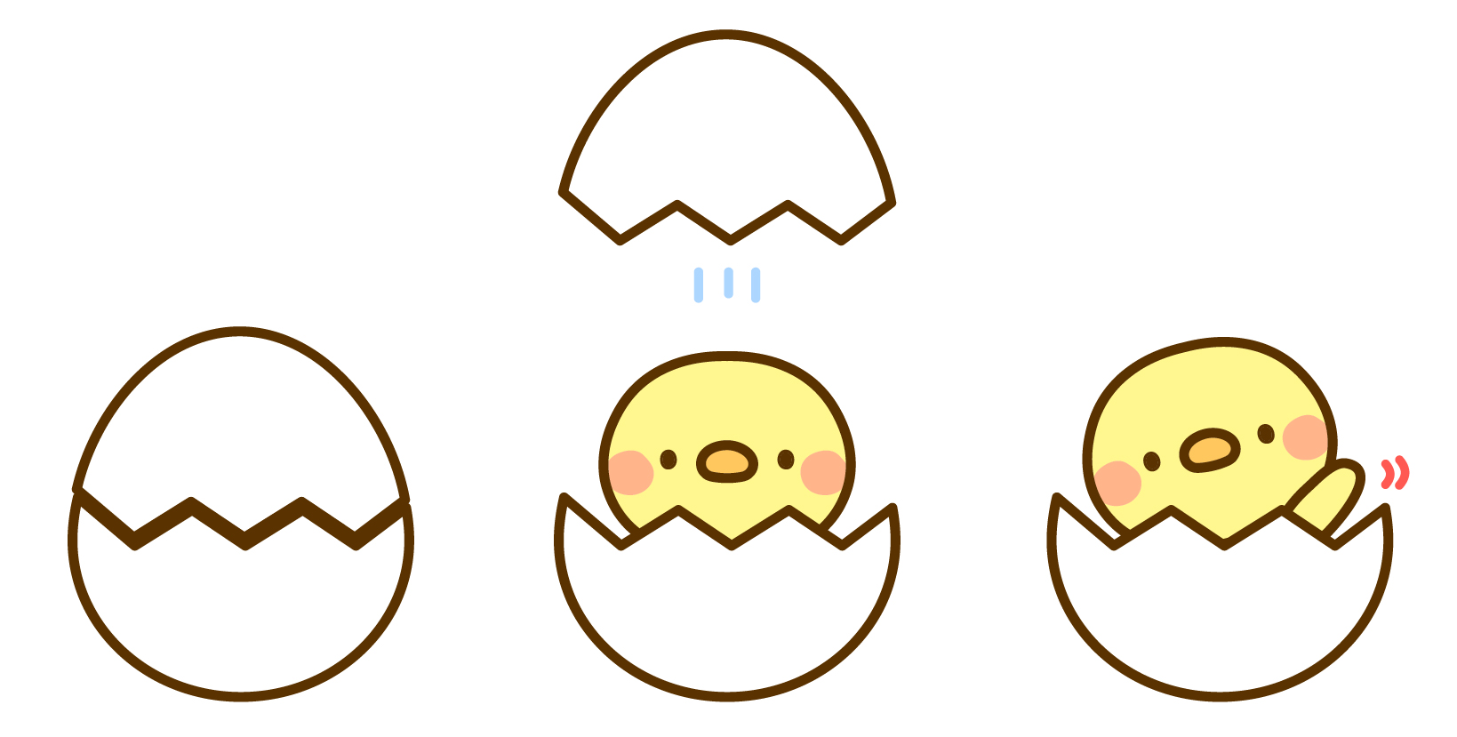
                    .splice {
    width: 200px;
    height: 400px;
    animation: splice 2s steps(1) infinite;
    background: url(img/splice.jpg) no-repeat 0 0;
    background-size: 600px auto;
}

@keyframes splice {
    0% {
        background-position: 0 0;
    }

    33.33% {
        background-position: -200px 0;
    }

    66.66% {
        background-position: -400px 0;
    }
}
アニメーション無効オプションとして使う
アニメーション処理が嫌いな人やスペックの低い端末向けのオプション機能として
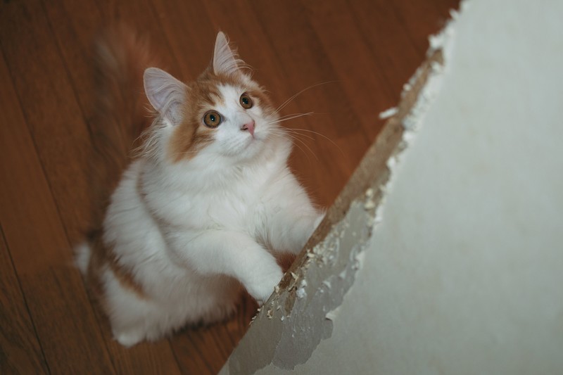
                    .catimg {
    transform: scale(0);
    transform-origin: left top;
}

.catimg.showcat {
    transform: scale(1);
    transition: 1s transform;
}
ボタンによるアニメーション処理のためにJavascriptも使用しています。
$('.btn-showcat').on('click', function () {
    var $img = $('.catimg')
    $img.removeClass('showcat');
    setTimeout(function () {
        $img.addClass('showcat');
    }, 100)

    return false;
})

$('#useAnimation').on('change', function () {
    var $img = $('.catimg');
    if ($(this).is(':checked')) {
        $img.css({
            'transition-timing-function': 'steps(1)',
            'transition-delay': '0s'
        })
    } else {
        $img.css({
            'transition-timing-function': '',
            'transition-delay': ''
        })

    }
})